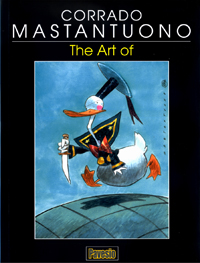
Da Percorsi n.4, Edizioni Il Penny (04.2004)
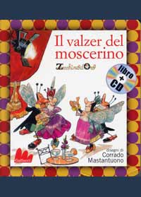
The first time I heard of Corrado as cartoonist (his name had been around for a while as illustrator) it was from Giovan Battista Carpi , at the time honoured Topolino offices in via Dante, Milan, when he showed me a file containing some of Corrado’s work: pencil sketches, partially inked panels, delicate illustrations done in Ecoline. “This is an artist from Rome, with a well-developed personal style he’s trying to adapt to Disney” he said, more or less. It was early in 1990, and the large open-space office with its huge light tables was buzzing with activity during the day. People were coming and going, asking questions; it was difficult for Carpi to do his own work except late at night, when everyone had finished toiling and gone home, and finally he could concentrate. The Ligurian Master was, at the time, busy recruiting new talents for what would soon become the famous Accademia Disney [Disney Academy], and in a few months Mastantuono would deliver a huge amount of drawings, cover art sketches and a few complete stories among which the very first, Zio Paperone e I’unica giovialità”, written by Fabio Michelini, was published in Topolino #1805 at the beginning of July. Obvious within these early pages is the influence of Giorgio Cavazzano, although with an unusual expressionistic twist, but Mastantuono’s personal touch is very evident especially with secondary characters, which he liberated from previous more rigid models. These were wrinkle-furrowed dog-faced extras, with protruding teeth and crooked postures, often depicted sporting whiskers and a big moustache of the kind favoured by Pedrito el Drito. In Mastantuono’s early work, however, there are also references to the classic Italian school, particularly in his first stories where the influence of Master Carpi is felt in part. Corrado was somehow protected from the invectives and corrections Carpi doled out to other colleagues as he was physically located far away from the Disney offices in his own Roman studio. There he could personalize his early 90’s work at his leisure. He is an extraordinarily fast draftsman, crunching out stories one after the other, working around the clock. And, when he manages to find the time for some public appearances, he has the rather belabored look of someone who has just got off work. Corrado, you are highly regarded as one of the most versatile artists in Italy, thanks to the ease with which you move from «realistic» to a very cartoonish style. I suppose you are aware of that…
I don’t see myself as realistic, humorous or cartoonish. As an artist I consider it to be a privilege to work with very different styles, this way I never get bored.
Tell us about your first contact with Giovan Battista Carpi.
In the spring of 1989 I received a phone call. I answered briskly. I was tired, I had been working hard and that call came at the wrong moment. “Certainly a nuisance!”, I thought. A slight voice at the other end introduced himself, politely and discreetly as Giovan Battista Carpi. I was speechless, but knew I had to say something. «Carpi? THE Carpi?”. He smiled. He told me Disney was looking for artists, and he had chanced upon some of my work at Mondadori. How kind of him to find it interesting. Shortly thereafter my collaboration with Disney started, and I will never forget the kind instructions he would impart over the phone. “Donald’s beak is too long in page four, panel three. Make it a couple millimeters shorter”. Those were great times.
When did you begin moving from a “classic” style, following the inspiration of Giorgio Cavazzano, and from there becoming «pure Mastantuono” ?
The transitions were so gradual that it is difficult to pinpoint a specific moment in time when they happened. Cavazzano is a sublime artist and it was impossible in first time for me not to be influenced by him when I took on Disney material.
When you became better acquainted with Cavazzano, did you ever discuss your early work? Also, did you discuss technical matters like the page layout or the characters graphic style ?
Giorgio is far too polite to openly remonstrate, but I know that around the early nineties he was a bit peeved about the hordes of beginners imitating him. These days when we meet, socially or at conventions, I still try to extort some technical trick from him and he, as all the real Greats, is ever ready to share his knowledge with such generosity.
In the wake of Kremos
You have often acknowledged that your first true Master was the great Niso Ramponi , better known as « Kremos ».
While teaching animation techniques in my class, Niso was looking forward to retirement. Generations of indolent and superficial students had spoiled him of all enthusiasm. Still, when he picked up a pencil it was a joy to behold, and how I envied his ability to draw a perfect porthole with just two strokes. Every single stroke was an entire art lesson in itself, every sketch a monument to his immense talent. I just couldn’t take my eyes off him, and with my eyes I «stole» everything I could from him. Everybody ought to admire, at least once, the fantastic covers he did for Travaso magazine in tempera. Almost everything I can do I owe to the hours spent watching Niso at work and noting what tools he would use. I imagine few could tell the difference between the «schedario» and the Cotton, between Bristol and Schoeller, Fabriano and vellum. In my professional life it was Niso that most helped clear my ideas, the choice of paper contributed to confuse them.
What do you mean by «schedario» ?
It’s a very «poor» kind of paper board originally used, I believe, to make folders for archival purposes. Its porous surface was just perfect for tempera but it’s almost unobtainable these days, so I had to switch to the «rich» Schoeller.
What’s your personal choice of tools? How do you match the type of paper with the work at hand? You pick one because of its «hold», or for its smoothness while you’re inking? What are your parameters?
I’m oriented towards classic techniques: pen, brush, China ink. I made some radical choices through the years, which I later radically changed. The combination of working instruments is extremely unstable. I constantly search for the right “alchemy”, the synergy of tools and materials in the optimal proportions. It drives me crazy. Paper suffers humidity, ink density varies, a pen-nib changes its trace according to paper surface, temperature, weather, a brush gets «crazy» forming an unusable double tip, withers and dies. There had been the season of the Bristol board. I used that for realistic comics, both ink and colour «held» very well. Then, suddenly, my favourite art-shop changed their supplier, or maybe the supplier changed their production. I don’t know, the fact was the ink didn’t take well on the new Bristol, it was rebellious, it shrunk. So I moved, skeptically, to Favini paper, then Fabriano, especially for my Bonelii work. There had been the Windsor & Newton season, their ink was expensive and came in a beautiful bottle, and then that of Pelikan ink, supple and fluid. Then there was the Schoeller-Durex season, but that simply disappeared, all of a sudden, replaced by the Schoeller-Hammer type, softer and more abrasive… I had to change all my pencils, getting harder ones, and then harder still. For about ten minutes every year I find myself with the perfect brush, ink perfectly diluted and paper which gives predictable results and…I draw like a pagan god. Ten minutes, less than half a panel every year.
Let’s get back to Niso Rampon i. You just watched him at work, trying to learn his secrets, or did he offer suggestions and corrections, helping you understand where you made mistakes, as Jijé did with his young assistant Jean Giraud , who would later become Moebius …?
I watched what he was doing and absorbed it. He never corrected anything, out of both modesty and laziness. It might be because of his aloofness that I’ll never be a Moebius . Will remain a mere mortal.
Ramponi was a great pin-up artist as well. He used to sign himself « Kremo s» when working for the satirical magazine «Il travaso delle idee”, very popular in pos-war years, then at a certain point he began using «Niso» . Do you know what had happened?
I had read an odd comment about that, made by his colleague Guglielmo Guastaveglia , also known as « Guasta », who was at the time the magazine’s chief editor. He wrote in his encyclopedia of satirical authors that, in order to avoid an unpleasant coincidence of pseudonyms, Ramponi decided to sign himself with his first name… that’s all I know.
Would you tell us about your early professional work? I have a videotape, with your old light bulb logo on, collecting your first advertising cartoons. Where did you work at, in Rome, and how, on which subjects?
I was seventeen, in 1980, when I was hired as animator at Ital-Studio, thanks to Niso ’s recommendation, by the way. There I learned a little bit of everything: storyboards, sceneries, slides, logos, illustrations, aside from animation, of course, which was why I had been hired in the first place. In ‘85, while still working at the studio, I started making short animations of my own, for the small private broad¬ casters. It will never be like that again. I was full of zest and enthusiasm then, I could draw for eighteen hours a day… I was a zombie!
Crazy about the Web-Spinner!
What was your favourite character as a kid? Which series ?
Geppo, Gianconiglio, Paperinik, Popeye, the Incredible Hulk… but the one character that really struck me was… Spider-man! I was never a true collector myself, but I have the entire Spider-man series published by Corno up to issue 250. I collected everything about the web spinner: daily strips, chewing-gum, posters. I nagged my mother to have her sewing his costume for my then favourite action figure, Big Jim . Nowadays I have a small shrine, just in front of my desk, with an original daily strip by John Romita , also a tribute to the most captivating Marvel artist. And I loved a lot of characters from the televised cartoons series. One above all: Atlas Ufo Robot .
The earliest stories I have read of yours were those from c Cargo Team, serialized by Comic Art. What can you tell us about the making of that series?
In ‘91 Rodolfo Torti was the art director and Roberto dal Prà the script supervisor, at Comic Art . Together they checked all new material and evaluated young authors and new series. As it happened, an absolute beginner, Arcangelo Stigliani , and a semi-absolute one, myself, gave life to Cargo Team , a science-fiction series with great ambitions, thwarted by the inexperience of us both. It was fun drawing it, although I had trouble initially with Stigliani’s copious writing, which left little room for the actual drawings. When the two of us finally managed to find a balance, the series was dropped. After a dramatic decrease in sales, the publisher decided to cease all production of new, original material and only to rely on reprints of foreign stuff. Amen.
There are references in there to the classic American style as well as that of Jordi Bernet .
What I always loved about Bernet , as well as of the entire Spanish and Argentinean school ( Font, Ortiz, De la Fuente ), was how they balanced black and white, which is fundamental for the graphic result. The great Alberto Breccia used to brilliantly explain its use in comics: «You have to put black where white is, and white where there’s black”. It sounds paradoxical, but the balance between these non-colours is the basic philosophy of comics. When you manage to grasp that technique, your work becomes immortal.
What artists do you think influenced you in the early stages of your career?
There are so many that I have loved through the years. I hope I don’t forget anyone: Romano Scarpa, Cavazzano, Carpi, Jacovitti, Magnus, Franquin, Quino, Carlos Nine, Uderzo and Pazienza for humor/caricature; John Romita Sr., Ivo Milazzo, Milo Manara, Alberto Breccia, Mandrafina, Zaffino, Bernet, Moebius for the realistic style. In some cases the love has faded with time, but I am grateful to each and every one of the above for how they unknowingly contributed to lighting a small candle in the darkness of my own art.
A Magical Wind blows
Your first encounter with Bonelli happened with an illustration for the exhibition Ridere di Paura [Laughing of Fear], in 1993. Their editorial office asked me to contact you because Bonelli’s chief editors were enthusiastic about your style, especially Renato Queirolo . What hap¬ pened then? Did you have to rework your own style specifically for the popular Bonelli’s «format” ?
That with Bonelli was another very difficult challenge. Up to that moment, with ComicArt , I had developed sort of a “graffiti” style. I liked to suggest rather than actually show. Now I had to confront a different type of public. The average reader of Bonelli’s publications would cry bloody murder at my experimental style. I had to change everything. With a lot of patience and the help of Queirolo, I developed, through the years, a drawing style that complies with the publisher’s needs without sacrificing my own nature.
How many revisions of your own “free” style had to take place? An author usually brings along a baggage of experience, projecting it on his future works. For instance, the Blueberry pages of the Moebius who went through The Airtight Garage of Jerry Cornelius , would have ce tainly been different without the Metal Hurlant experi
ence…
I have the presumption of trying to keep my different creative lives separated. In my mind, I maniacally sort the materials and tools I would need for different jobs. If I begin drawing the monthly panel for the such-and-such magazine with markers on layout paper, I’ll continue using the same style and tools throughout the whole assignment, even if it lasts years. Influence, however, still exists. Contaminations are inevitable. The style experimented with success in realistic drawing modifies, subtly but effectively, also the cartoonish drawings.
How did you get in touch with Gianfranco Manfredi about Magico Vento ?
Through the series’ editor, Queirolo again.
And how did your collaboration with Manfredi go? Is he a meticulous and demanding scriptwriter, or does he allow for artistic freedom?
I had previously worked with him for a Nick Raider issue, La rosa gialla del Texas (Texas Yellow Rose), and felt very much at ease. After Magico Vento , Manfredi is the Bonelli author I had worked with more often. Luckily, he’s not the sort of over-descriptive writer, and does allow for enough freedom of interpretation. He requires perhaps too many full-length shots of characters from above, and I try to comply whenever possible, but most of the time I steer towards solutions that are more congenial to me.
What’s most satisfying about participating in a series like Magico Vento , appreciated by both readers and critics and featuring an excellent team of artists? Are you kidding? Nothing! Eh,eh!
For a western comic you need to know every little detail of items to be drawn, endlessly researching sources and pictures from the period. Dust is difficult to render. Dirt, sweat, the pioneers’ effort has to convincingly flow from the page, with no self-complacence, no hesitations. It’s hell! I must admit, though, Magico Vento got me so absorbed that I forget the exertion, and becoming the series’ cover artist was the best thing that could have happened to me. If I’m not mistaken, your first story for Bonelli was a short Nick Raider episode, published as a supplement to the magazine Amico Treno . Actually, the very first story I did for them was Un uomo nel mirino , for the Nick Raider monthly. I can hardly recognize myself in those pages, now… but they’re not too bad.
What’s most rewarding, what do you find hard and what’s more fun for you to do, when drawing?
The biggest problem is research and documentation. I’m lazy and, whenever possible, I try to get by just on my imagination. Which I shouldn’t do. But I really enjoy switching from one style to another, it stirs my enthusiasm.
Scriptwriting necesse est
Before your early experiments with Topolino , you already had a pressing desire for scriptwriting? I’m thinking about your satirical gags for Comic Art …
I’ve always loved writing. I first did some short stories for Comic Art, then continued with a series, in colour, for another magazine by the same publisher, L’Eternauta (II droppo, Todavia, King Kong la grande scimmia).
Why did you employ, in those panels, a more aggressive style, sort of «fractured», close to both Tullio Pericoli and Riccardo Mannelli?
I wasn’t thinking of them when I did those. The style was a mix of the loose characters from my cartoons and those of Disney, brought to the limit. Inking was done in markers, with grays and shadows that were supposed to counteract the childish synthesis with which the characters had been constructed. Now that you mention it, however, I remember a Comic Art cover I had dedicated to Tullio Pericoli . His name appeared, if memory serves, on a chocolate box held by a fat butterfly.
Were you pleased with your first story drawn for Topolino ?
«Pleased” is a big word. Let’s say that while recognizing the difference between my pages and those of the pros, I thought I just couldn’t do any better than that. I was content; not frustrated. I remember, however, after drawing some 20 pages, that a single panel caught my attention as really pleasing. It looked «real». Yes, I mean, as if it had been drawn by some other artists, some of the good ones. I had finally succeeded in putting ducks within a space in a believable way. I was overwhelmed, but it was just by chance, then.
Tell us about your scriptwriting for Disney . How did you start that? Was it a desire to communicate positive thoughts to a wide and diverse public like that of Topolino ?
Well, I try to keep away from rethorical moralities and saccharine-sweetness as much as I can, even though Disney characters , including my Bum Bum , whom I use more often than others, certainly carry positive values. Finding the balance is not always easy. I remember a beautiful story of yours, from 1999, Paperino e il sinistro dottor Murdy . In your Disney stories there’s special attention given to the «misfit», the monster. We all fear monsters. The misfits compel us to take into consideration a point of view that’s different than ours and that, in the swamp of insecurity through which we crawl, it’scares us. But we need to force our view to take in wider horizons. Thus, I wanted to write a story from the point of view of the misfits. They aren’t worse than us, nor better. They live and they make mistakes (as doctor Murdy will), but they have to cope with more problems than we do.
The world beyond the drawing board
When you’re asked for illustrations for some social or civil rights campaign, you always comply. It makes one think you have certain empathy for these problems. What do you think should be done to make the world a better place for people ?
Well, not an easy question to answer. I don’t know… perhaps the western countries should give up some of what they have, to allow a decent life in countries where mere survival is a problem. Instead of piling up nuclear weapons, which are obviously unable to defend us against terrorism, we ought to send our armies around the world to rebuild infrastructures, deliver clean drinking water and feed famished children. The world would then be a safer place.
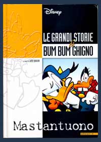
One of your most beloved characters is working class Bum Bum Ghigno . Some philologist fans tell me Luciano Bottaro had imagined a character with a similar name. Is yours a homage to the Maestro from Rapallo ? If not, how did that odd name come about?
The truth is simply that Bum Bum should have exhausted his purpose in the first story, where he plays the bad guy who redeems himself. The name was the result of five seconds thinking, but before I realized what was happening, he’d become a star. With a moron’s name.
Most Disney characters don’t have a regular job, some you don’t even know how they manage to make a living, but Bum Bum does. And it’s not as if he has a fancy job like reporter or detective… what’s the meaning of having made him a decorator, or rather a «painter», as he says himself, a typical working class job?
Bum Bum is not smart enough to be a detective or reporter. Decorating is a tough job, especially when you never get an assignment, but it’s the only thing he’s able to do and. modesty aside, he does it very bad! After all, it’s a freelancing activity, with long pauses between assignments, and that makes his adventures around the world more believable.
You know in some North-European translations Bum Bum has been identified as a East-European immigrant, settled in Duckburg?
Yeah, I think they call him Sergei Schlamassi in Germany, and Grovfrans in Denmark. Well, if they really had to make him an immigrant, I would have rather preferred him to be Italian, but I like the idea of him being a misfit nevertheless.
Did somebody you know inspire his creation?
I want to make clear that Bum Bum wasn’t planned, he sort of happened! He slowly evolved, piece by piece, without any clear reference, not knowing where he would go. With time, however, I realized that, while writing Bum Bum stories, my mind wandered to an old acquaintance of mine, a schoolmate for many years and a playmate of a thousand silly games. He was the first eliminated at Risk, a game we still play every now and then. I’m not going to give his name, he doesn’t deserve popularity, but his rough sensitivity helps me better shape our hero’s adventures.
Homages and special illustrations
How come you quoted Signor Bonaventura by Sergio Tofano , in your story Paperino nel Bum dipinto di Bum , also using its original structure with the rhyming captions? Tofano is practically unknown to Disney readers, and so is the ancient Corriere dei Piccoli .
Curiosity makes the world go round. I imagined a child, with the comic book open, asking his dad about those bizarre pages. And I figured dad, remembering with tenderness his own childhood readings, exhaustively explaining. I imagined father and child exchanging a glance of complicity.
I know, it probably wouldn’t go exactly like that: the child would have skipped the story altogether, annoyed, and dad, who’d really never read a comic book in his life, would have been late from work and found the child already asleep, and that would be that… But at least I gave it a try!
Did you have any troubles in having this script accepted?
It was meant as a homage to Signor Bonaventura, a milestone in the history of Italian comics, and the publisher understood that. Those pages with the rhyming captions are a reference that one might miss without compromising the story flow.
Let’s talk about some of the illustrations included in this book. You’ve used mixed techniques in some cases. I remember a beautiful painting you did with Black Pete, using different materials, sort of a painted collage, for one of the contests organized by Disney Italia in the 90s, under president Umberto Virri ’s patronage. Was that sort of a «release» for you?
Not working for wages, as was the case, gives the opportunity to freely experiment. It’s one of the rare occasions in which you don’t have to worry about pleasing the customer. The collage is an ancient and «poor» form of art which I, as a novice, have barely skimmed.
Another wonderful illustration is that where Disney characters in a fortified medieval tower resist the assaults of other comics characters of the most various origin. How did this idea occur to you?
Same as in the previous case, it was an internal contest at Disney’s. We were given a theme, which that year was something like… “A historical period seen through Disney characters”. I choose the Middle Ages, and thought it would suit the gag fine. I wanted it to have a Mordillo “flavour” in which all, and I mean All Disney characters would appear.
Among your recent work there’s the collaboration with Edizioni IF , for whom you make the covers for IF magazine and other things. Especially notable are those with the Esse-G-Esse characters like Blek Macigno and Capitan Miki. You also made the beautiful painted cover of a 2003 calendar for them. Would you tell us about this experience ?
That illustration was created as a limited edition litho¬ graph, 200 copies, for a Cartoomics a few years ago. It took more to autograph the 200 copies than to make the illustration itself, they seemed to never end. Esse-G-Esse , lots of memories… the elder brother of a schoolmate was a fanatic of Blek and Miki . One lazy summer I managed to get over his distrust and borrowed, with some reluctance on his part, a stack of comics, which I feverishly devoured. That was my first meeting with realistic comics, those «for adults” as I then thought. It was an enthusiastic initiation, to say the least. I thought I would continue following those series, but soon Spider-man arrived sweeping away anything else.
Is there any other “historical” character of Italian comics you would like to tackle your way? And why?
Donald Duck, Mickey Mouse, Nick Raider, Magico Vento, Tex, Diabolik, Blek, Miki… I think that’s enough. Eh, eh!
The first time I heard of Corrado as cartoonist (his name had been around for a while as illustrator) it was from Giovan Battista Carpi , at the time honoured Topolino offices in via Dante, Milan, when he showed me a file containing some of Corrado’s work: pencil sketches, partially inked panels, delicate illustrations done in Ecoline. “This is an artist from Rome, with a well-developed personal style he’s trying to adapt to Disney” he said, more or less. It was early in 1990, and the large open-space office with its huge light tables was buzzing with activity during the day. People were coming and going, asking questions; it was difficult for Carpi to do his own work except late at night, when everyone had finished toiling and gone home, and finally he could concentrate. The Ligurian Master was, at the time, busy recruiting new talents for what would soon become the famous Accademia Disney [Disney Academy], and in a few months Mastantuono would deliver a huge amount of drawings, cover art sketches and a few complete stories among which the very first, Zio Paperone e I’unica giovialità”, written by Fabio Michelini, was published in Topolino #1805 at the beginning of July. Obvious within these early pages is the influence of Giorgio Cavazzano, although with an unusual expressionistic twist, but Mastantuono’s personal touch is very evident especially with secondary characters, which he liberated from previous more rigid models. These were wrinkle-furrowed dog-faced extras, with protruding teeth and crooked postures, often depicted sporting whiskers and a big moustache of the kind favoured by Pedrito el Drito. In Mastantuono’s early work, however, there are also references to the classic Italian school, particularly in his first stories where the influence of Master Carpi is felt in part. Corrado was somehow protected from the invectives and corrections Carpi doled out to other colleagues as he was physically located far away from the Disney offices in his own Roman studio. There he could personalize his early 90’s work at his leisure. He is an extraordinarily fast draftsman, crunching out stories one after the other, working around the clock. And, when he manages to find the time for some public appearances, he has the rather belabored look of someone who has just got off work. Corrado, you are highly regarded as one of the most versatile artists in Italy, thanks to the ease with which you move from «realistic» to a very cartoonish style. I suppose you are aware of that…
I don’t see myself as realistic, humorous or cartoonish. As an artist I consider it to be a privilege to work with very different styles, this way I never get bored.
Tell us about your first contact with Giovan Battista Carpi.
In the spring of 1989 I received a phone call. I answered briskly. I was tired, I had been working hard and that call came at the wrong moment. “Certainly a nuisance!”, I thought. A slight voice at the other end introduced himself, politely and discreetly as Giovan Battista Carpi. I was speechless, but knew I had to say something. «Carpi? THE Carpi?”. He smiled. He told me Disney was looking for artists, and he had chanced upon some of my work at Mondadori. How kind of him to find it interesting. Shortly thereafter my collaboration with Disney started, and I will never forget the kind instructions he would impart over the phone. “Donald’s beak is too long in page four, panel three. Make it a couple millimeters shorter”. Those were great times.
When did you begin moving from a “classic” style, following the inspiration of Giorgio Cavazzano, and from there becoming «pure Mastantuono” ?
The transitions were so gradual that it is difficult to pinpoint a specific moment in time when they happened. Cavazzano is a sublime artist and it was impossible in first time for me not to be influenced by him when I took on Disney material.
When you became better acquainted with Cavazzano, did you ever discuss your early work? Also, did you discuss technical matters like the page layout or the characters graphic style ?
Giorgio is far too polite to openly remonstrate, but I know that around the early nineties he was a bit peeved about the hordes of beginners imitating him. These days when we meet, socially or at conventions, I still try to extort some technical trick from him and he, as all the real Greats, is ever ready to share his knowledge with such generosity.
In the wake of Kremos
You have often acknowledged that your first true Master was the great Niso Ramponi , better known as « Kremos ».
While teaching animation techniques in my class, Niso was looking forward to retirement. Generations of indolent and superficial students had spoiled him of all enthusiasm. Still, when he picked up a pencil it was a joy to behold, and how I envied his ability to draw a perfect porthole with just two strokes. Every single stroke was an entire art lesson in itself, every sketch a monument to his immense talent. I just couldn’t take my eyes off him, and with my eyes I «stole» everything I could from him. Everybody ought to admire, at least once, the fantastic covers he did for Travaso magazine in tempera. Almost everything I can do I owe to the hours spent watching Niso at work and noting what tools he would use. I imagine few could tell the difference between the «schedario» and the Cotton, between Bristol and Schoeller, Fabriano and vellum. In my professional life it was Niso that most helped clear my ideas, the choice of paper contributed to confuse them.
What do you mean by «schedario» ?
It’s a very «poor» kind of paper board originally used, I believe, to make folders for archival purposes. Its porous surface was just perfect for tempera but it’s almost unobtainable these days, so I had to switch to the «rich» Schoeller.
What’s your personal choice of tools? How do you match the type of paper with the work at hand? You pick one because of its «hold», or for its smoothness while you’re inking? What are your parameters?
I’m oriented towards classic techniques: pen, brush, China ink. I made some radical choices through the years, which I later radically changed. The combination of working instruments is extremely unstable. I constantly search for the right “alchemy”, the synergy of tools and materials in the optimal proportions. It drives me crazy. Paper suffers humidity, ink density varies, a pen-nib changes its trace according to paper surface, temperature, weather, a brush gets «crazy» forming an unusable double tip, withers and dies. There had been the season of the Bristol board. I used that for realistic comics, both ink and colour «held» very well. Then, suddenly, my favourite art-shop changed their supplier, or maybe the supplier changed their production. I don’t know, the fact was the ink didn’t take well on the new Bristol, it was rebellious, it shrunk. So I moved, skeptically, to Favini paper, then Fabriano, especially for my Bonelii work. There had been the Windsor & Newton season, their ink was expensive and came in a beautiful bottle, and then that of Pelikan ink, supple and fluid. Then there was the Schoeller-Durex season, but that simply disappeared, all of a sudden, replaced by the Schoeller-Hammer type, softer and more abrasive… I had to change all my pencils, getting harder ones, and then harder still. For about ten minutes every year I find myself with the perfect brush, ink perfectly diluted and paper which gives predictable results and…I draw like a pagan god. Ten minutes, less than half a panel every year.
Let’s get back to Niso Rampon i. You just watched him at work, trying to learn his secrets, or did he offer suggestions and corrections, helping you understand where you made mistakes, as Jijé did with his young assistant Jean Giraud , who would later become Moebius …?
I watched what he was doing and absorbed it. He never corrected anything, out of both modesty and laziness. It might be because of his aloofness that I’ll never be a Moebius .Will remain a mere mortal.
Ramponi was a great pin-up artist as well. He used to sign himself « Kremo s» when working for the satirical magazine «Il travaso delle idee”, very popular in pos-war years, then at a certain point he began using «Niso» . Do you know what had happened?
I had read an odd comment about that, made by his colleague Guglielmo Guastaveglia , also known as « Guasta », who was at the time the magazine’s chief editor. He wrote in his encyclopedia of satirical authors that, in order to avoid an unpleasant coincidence of pseudonyms, Ramponi decided to sign himself with his first name… that’s all I know.
Would you tell us about your early professional work? I have a videotape, with your old light bulb logo on, collecting your first advertising cartoons. Where did you work at, in Rome, and how, on which subjects?
I was seventeen, in 1980, when I was hired as animator at Ital-Studio, thanks to Niso ’s recommendation, by the way. There I learned a little bit of everything: storyboards, sceneries, slides, logos, illustrations, aside from animation, of course, which was why I had been hired in the first place. In ‘85, while still working at the studio, I started making short animations of my own, for the small private broad¬ casters. It will never be like that again. I was full of zest and enthusiasm then, I could draw for eighteen hours a day… I was a zombie!
Crazy about the Web-Spinner!
What was your favourite character as a kid? Which series ?
Geppo, Gianconiglio, Paperinik, Popeye, the Incredible Hulk… but the one character that really struck me was… Spider-man! I was never a true collector myself, but I have the entire Spider-man series published by Corno up to issue 250. I collected everything about the web spinner: daily strips, chewing-gum, posters. I nagged my mother to have her sewing his costume for my then favourite action figure, Big Jim . Nowadays I have a small shrine, just in front of my desk, with an original daily strip by John Romita , also a tribute to the most captivating Marvel artist. And I loved a lot of characters from the televised cartoons series. One above all: Atlas Ufo Robot .
The earliest stories I have read of yours were those from c Cargo Team, serialized by Comic Art. What can you tell us about the making of that series?
In ‘91 Rodolfo Torti was the art director and Roberto dal Prà the script supervisor, at Comic Art . Together they checked all new material and evaluated young authors and new series. As it happened, an absolute beginner, Arcangelo Stigliani , and a semi-absolute one, myself, gave life to Cargo Team , a science-fiction series with great ambitions, thwarted by the inexperience of us both. It was fun drawing it, although I had trouble initially with Stigliani’s copious writing, which left little room for the actual drawings. When the two of us finally managed to find a balance, the series was dropped. After a dramatic decrease in sales, the publisher decided to cease all production of new, original material and only to rely on reprints of foreign stuff. Amen.
There are references in there to the classic American style as well as that of Jordi Bernet.
What I always loved about Bernet , as well as of the entire Spanish and Argentinean school ( Font, Ortiz, De la Fuente ), was how they balanced black and white, which is fundamental for the graphic result. The great Alberto Breccia used to brilliantly explain its use in comics: «You have to put black where white is, and white where there’s black”. It sounds paradoxical, but the balance between these non-colours is the basic philosophy of comics. When you manage to grasp that technique, your work becomes immortal.
What artists do you think influenced you in the early stages of your career?
There are so many that I have loved through the years. I hope I don’t forget anyone: Romano Scarpa, Cavazzano, Carpi, Jacovitti, Magnus, Franquin, Quino, Carlos Nine, Uderzo and Pazienza for humor/caricature; John Romita Sr., Ivo Milazzo, Milo Manara, Alberto Breccia, Mandrafina, Zaffino, Bernet, Moebius for the realistic style. In some cases the love has faded with time, but I am grateful to each and every one of the above for how they unknowingly contributed to lighting a small candle in the darkness of my own art.
A Magical Wind blows
Your first encounter with Bonelli happened with an illustration for the exhibition Ridere di Paura [Laughing of Fear], in 1993. Their editorial office asked me to contact you because Bonelli’s chief editors were enthusiastic about your style, especially Renato Queirolo . What hap¬ pened then? Did you have to rework your own style specifically for the popular Bonelli’s «format” ?
That with Bonelli was another very difficult challenge. Up to that moment, with ComicArt , I had developed sort of a “graffiti” style. I liked to suggest rather than actually show. Now I had to confront a different type of public. The average reader of Bonelli’s publications would cry bloody murder at my experimental style. I had to change everything. With a lot of patience and the help of Queirolo, I developed, through the years, a drawing style that complies with the publisher’s needs without sacrificing my own nature.
How many revisions of your own “free” style had to take place? An author usually brings along a baggage of experience, projecting it on his future works. For instance, the Blueberry pages of the Moebius who went through The Airtight Garage of Jerry Cornelius , would have ce tainly been different without the Metal Hurlant experience…
I have the presumption of trying to keep my different creative lives separated. In my mind, I maniacally sort the materials and tools I would need for different jobs. If I begin drawing the monthly panel for the such-and-such magazine with markers on layout paper, I’ll continue using the same style and tools throughout the whole assignment, even if it lasts years. Influence, however, still exists. Contaminations are inevitable. The style experimented with success in realistic drawing modifies, subtly but effectively, also the cartoonish drawings.
How did you get in touch with Gianfranco Manfredi about Magico Vento?
Through the series’ editor, Queirolo again.
And how did your collaboration with Manfredi go? Is he a meticulous and demanding scriptwriter, or does he allow for artistic freedom?
I had previously worked with him for a Nick Raider issue, La rosa gialla del Texas (Texas Yellow Rose), and felt very much at ease. After Magico Vento , Manfredi is the Bonelli author I had worked with more often. Luckily, he’s not the sort of over-descriptive writer, and does allow for enough freedom of interpretation. He requires perhaps too many full-length shots of characters from above, and I try to comply whenever possible, but most of the time I steer towards solutions that are more congenial to me.
What’s most satisfying about participating in a series like Magico Vento , appreciated by both readers and critics and featuring an excellent team of artists? Are you kidding? Nothing! Eh,eh!
For a western comic you need to know every little detail of items to be drawn, endlessly researching sources and pictures from the period. Dust is difficult to render. Dirt, sweat, the pioneers’ effort has to convincingly flow from the page, with no self-complacence, no hesitations. It’s hell! I must admit, though, Magico Vento got me so absorbed that I forget the exertion, and becoming the series’ cover artist was the best thing that could have happened to me. If I’m not mistaken, your first story for Bonelli was a short Nick Raider episode, published as a supplement to the magazine Amico Treno . Actually, the very first story I did for them was Un uomo nel mirino , for the Nick Raider monthly. I can hardly recognize myself in those pages, now… but they’re not too bad.
What’s most rewarding, what do you find hard and what’s more fun for you to do, when drawing?
The biggest problem is research and documentation. I’m lazy and, whenever possible, I try to get by just on my imagination. Which I shouldn’t do. But I really enjoy switching from one style to another, it stirs my enthusiasm.
Scriptwriting necesse est
Before your early experiments with Topolino , you already had a pressing desire for scriptwriting? I’m thinking about your satirical gags for Comic Art …
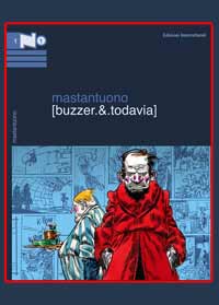
I’ve always loved writing. I first did some short stories for Comic Art, then continued with a series, in colour, for another magazine by the same publisher, L’Eternauta (II droppo, Todavia, King Kong la grande scimmia).
Why did you employ, in those panels, a more aggressive style, sort of «fractured», close to both Tullio Pericoli and Riccardo Mannelli?
I wasn’t thinking of them when I did those. The style was a mix of the loose characters from my cartoons and those of Disney, brought to the limit. Inking was done in markers, with grays and shadows that were supposed to counteract the childish synthesis with which the characters had been constructed. Now that you mention it, however, I remember a Comic Art cover I had dedicated to Tullio Pericoli . His name appeared, if memory serves, on a chocolate box held by a fat butterfly.
Were you pleased with your first story drawn for Topolino?
«Pleased” is a big word. Let’s say that while recognizing the difference between my pages and those of the pros, I thought I just couldn’t do any better than that. I was content; not frustrated. I remember, however, after drawing some 20 pages, that a single panel caught my attention as really pleasing. It looked «real». Yes, I mean, as if it had been drawn by some other artists, some of the good ones. I had finally succeeded in putting ducks within a space in a believable way. I was overwhelmed, but it was just by chance, then.
Tell us about your scriptwriting for Disney . How did you start that? Was it a desire to communicate positive thoughts to a wide and diverse public like that of Topolino?
Well, I try to keep away from rethorical moralities and saccharine-sweetness as much as I can, even though Disney characters , including my Bum Bum , whom I use more often than others, certainly carry positive values. Finding the balance is not always easy. I remember a beautiful story of yours, from 1999, Paperino e il sinistro dottor Murdy . In your Disney stories there’s special attention given to the «misfit», the monster. We all fear monsters. The misfits compel us to take into consideration a point of view that’s different than ours and that, in the swamp of insecurity through which we crawl, it’scares us. But we need to force our view to take in wider horizons. Thus, I wanted to write a story from the point of view of the misfits. They aren’t worse than us, nor better. They live and they make mistakes (as doctor Murdy will), but they have to cope with more problems than we do.
The world beyond the drawing board
When you’re asked for illustrations for some social or civil rights campaign, you always comply. It makes one think you have certain empathy for these problems. What do you think should be done to make the world a better place for people?
Well, not an easy question to answer. I don’t know… perhaps the western countries should give up some of what they have, to allow a decent life in countries where mere survival is a problem. Instead of piling up nuclear weapons, which are obviously unable to defend us against terrorism, we ought to send our armies around the world to rebuild infrastructures, deliver clean drinking water and feed famished children. The world would then be a safer place.
One of your most beloved characters is working class Bum Bum Ghigno . Some philologist fans tell me Luciano Bottaro had imagined a character with a similar name. Is yours a homage to the Maestro from Rapallo ? If not, how did that odd name come about?
The truth is simply that Bum Bum should have exhausted his purpose in the first story, where he plays the bad guy who redeems himself. The name was the result of five seconds thinking, but before I realized what was happening, he’d become a star. With a moron’s name.
Most Disney characters don’t have a regular job, some you don’t even know how they manage to make a living, but Bum Bum does. And it’s not as if he has a fancy job like reporter or detective… what’s the meaning of having made him a decorator, or rather a «painter», as he says himself, a typical working class job?
Bum Bum is not smart enough to be a detective or reporter. Decorating is a tough job, especially when you never get an assignment, but it’s the only thing he’s able to do and. modesty aside, he does it very bad! After all, it’s a freelancing activity, with long pauses between assignments, and that makes his adventures around the world more believable.
You know in some North-European translations Bum Bum has been identified as a East-European immigrant, settled in Duckburg?
Yeah, I think they call him Sergei Schlamassi in Germany, and Grovfrans in Denmark. Well, if they really had to make him an immigrant, I would have rather preferred him to be Italian, but I like the idea of him being a misfit nevertheless.
Did somebody you know inspire his creation?
I want to make clear that Bum Bum wasn’t planned, he sort of happened! He slowly evolved, piece by piece, without any clear reference, not knowing where he would go. With time, however, I realized that, while writing Bum Bum stories, my mind wandered to an old acquaintance of mine, a schoolmate for many years and a playmate of a thousand silly games. He was the first eliminated at Risk, a game we still play every now and then. I’m not going to give his name, he doesn’t deserve popularity, but his rough sensitivity helps me better shape our hero’s adventures.
Homages and special illustrations
How come you quoted Signor Bonaventura by Sergio Tofano , in your story Paperino nel Bum dipinto di Bum , also using its original structure with the rhyming captions? Tofano is practically unknown to Disney readers, and so is the ancient Corriere dei Piccoli .
Curiosity makes the world go round. I imagined a child, with the comic book open, asking his dad about those bizarre pages. And I figured dad, remembering with tenderness his own childhood readings, exhaustively explaining. I imagined father and child exchanging a glance of complicity.
I know, it probably wouldn’t go exactly like that: the child would have skipped the story altogether, annoyed, and dad, who’d really never read a comic book in his life, would have been late from work and found the child already asleep, and that would be that… But at least I gave it a try!
Did you have any troubles in having this script accepted?
It was meant as a homage to Signor Bonaventura, a milestone in the history of Italian comics, and the publisher understood that. Those pages with the rhyming captions are a reference that one might miss without compromising the story flow.
Let’s talk about some of the illustrations included in this book. You’ve used mixed techniques in some cases. I remember a beautiful painting you did with Black Pete, using different materials, sort of a painted collage, for one of the contests organized by Disney Italia in the 90s, under president Umberto Virri ’s patronage. Was that sort of a «release» for you?
Not working for wages, as was the case, gives the opportunity to freely experiment. It’s one of the rare occasions in which you don’t have to worry about pleasing the customer. The collage is an ancient and «poor» form of art which I, as a novice, have barely skimmed.
Another wonderful illustration is that where Disney characters in a fortified medieval tower resist the assaults of other comics characters of the most various origin. How did this idea occur to you?
Same as in the previous case, it was an internal contest at Disney’s. We were given a theme, which that year was something like… “A historical period seen through Disney characters”. I choose the Middle Ages, and thought it would suit the gag fine. I wanted it to have a Mordillo “flavour” in which all, and I mean All Disney characters would appear.
Among your recent work there’s the collaboration with Edizioni IF , for whom you make the covers for IF magazine and other things. Especially notable are those with the Esse-G-Esse characters like Blek Macigno and Capitan Miki. You also made the beautiful painted cover of a 2003 calendar for them. Would you tell us about this experience?
That illustration was created as a limited edition litho¬ graph, 200 copies, for a Cartoomics a few years ago. It took more to autograph the 200 copies than to make the illustration itself, they seemed to never end. Esse-G-Esse , lots of memories… the elder brother of a schoolmate was a fanatic of Blek and Miki . One lazy summer I managed to get over his distrust and borrowed, with some reluctance on his part, a stack of comics, which I feverishly devoured. That was my first meeting with realistic comics, those «for adults” as I then thought. It was an enthusiastic initiation, to say the least. I thought I would continue following those series, but soon Spider-man arrived sweeping away anything else.
Is there any other “historical” character of Italian comics you would like to tackle your way? And why?
Donald Duck, Mickey Mouse, Nick Raider, Magico Vento, Tex, Diabolik, Blek, Miki… I think that’s enough. Eh, eh!